What to Put on the Big Screen: Floor Dashboards Operators Actually Read
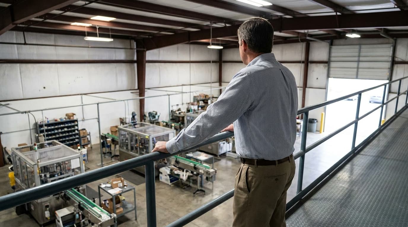
Every plant eventually mounts a big screen over the line. Six weeks later, nobody looks at it. The difference between a dashboard and wallpaper is what you choose to show — and who you design it for.
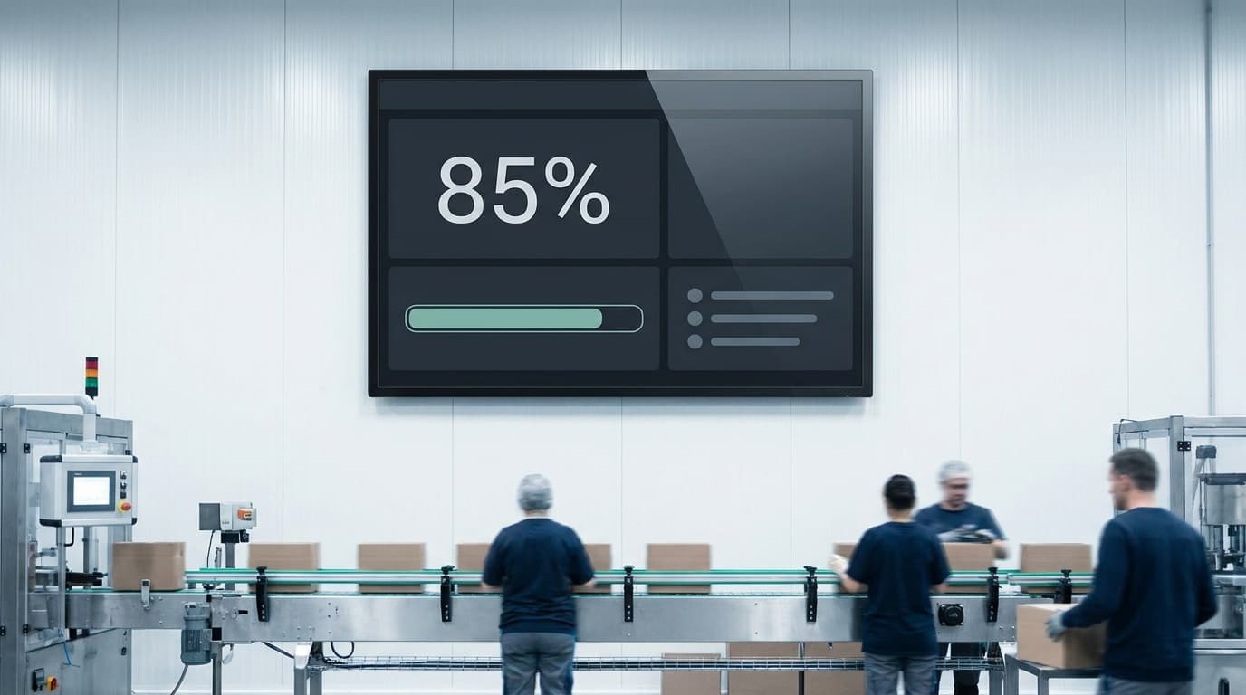
There's a predictable lifecycle to the shop-floor TV. Month one: it goes up, everyone looks at it, someone photographs it for the company newsletter. Month two: glances. Month three: it has achieved the status of the safety poster beside it — technically visible, effectively invisible. The screen still works. It just stopped being *read*.
The failure is almost never the hardware or the data. It's that the screen was designed as a small copy of the manager's dashboard, and a manager's dashboard answers questions nobody on the floor is asking. A line-side screen has a different audience, viewing distance, and glance duration — about three seconds, from ten meters, while doing something else. Design for that, and the screen stays alive.
The three questions a floor screen should answer
How are we doing right now? Current state, unmissable from across the aisle: running or stopped, current rate against target, and if stopped — for how long. This is the heartbeat, and it earns the screen its glances. An operator (or a passing supervisor) should be able to read the line's condition without breaking stride.
How is the shift going? Progress against a target the crew recognizes: units toward the shift's goal, ideally as "ahead/behind by N" rather than a raw total. People don't rally around 14,206; they rally around *400 behind, two hours left* — a number with a story and a deadline built in. This is also where honest context prevents demoralization: if a 50-minute changeover is scheduled mid-shift, the target should know that, or the screen spends two hours announcing a failure that's actually the plan.
What's eating us today? Today's top stop reasons, live. Not a Pareto of the quarter — today: "changeover 48 min, cap feeder 22 min, film breaks 15 min." This line of the screen does quiet cultural work. It shows the crew that the stops they log go somewhere visible, immediately — the fastest feedback loop a logging system can offer. And it aims the whole crew's attention at the same problem, which is how "someone should look at that feeder" turns into someone actually looking.
That's the screen. Three zones, readable in three seconds.
What to leave off
Almost everything else, and two things in particular.
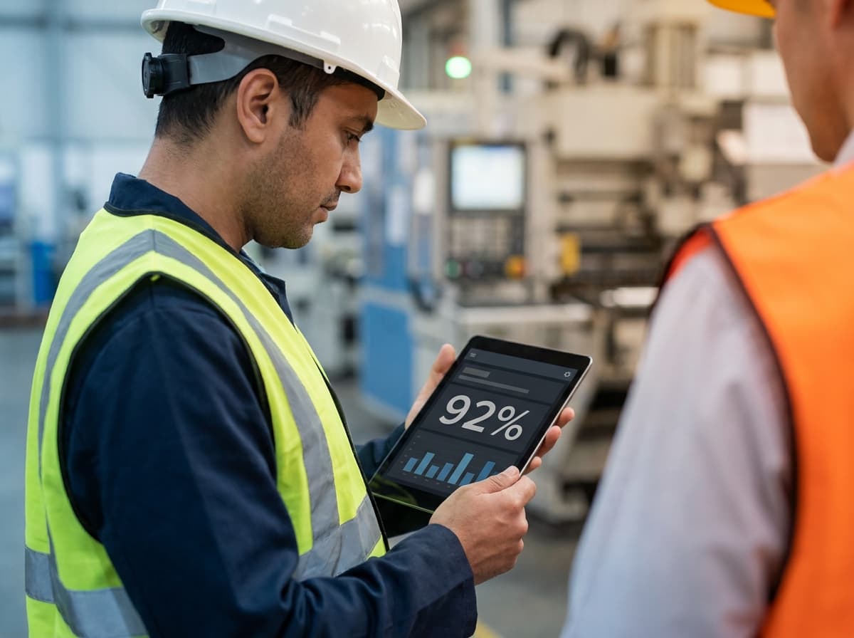
The OEE percentage itself is a surprisingly weak choice for the big screen. It updates slowly, moves for reasons that need explanation, and invites exactly the grading dynamic that poisons floors — a big red 58% over a crew's heads all shift is a verdict, not information. The components that *built* the number (stops, rate, rejects) are all more actionable than the number. OEE belongs in the meeting, where it comes with a conversation; the screen should carry the ingredients. (More on that dynamic in OEE is a thermometer, not a report card.)
Anything requiring explanation. Every acronym a new hire wouldn't know, every chart needing a legend, every metric where the desirable direction isn't obvious — each one converts the screen from information into decoration. The test is brutal but useful: a temp on their first day should understand the whole screen without asking.
And resist the rotating-slides temptation. A carousel means the number someone glances for is elsewhere two glances out of three, which trains people to stop glancing. One static, stable layout. If everything doesn't fit, that's the prioritization working as intended.
Design details that decide the outcome
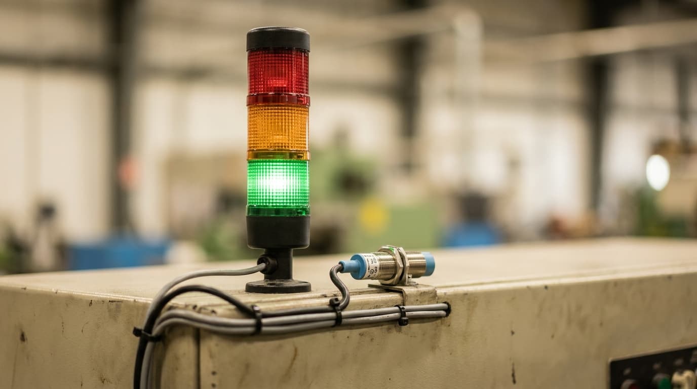
Type sized for the actual distance — the rule of thumb is a legible read at the far edge of the work area, which usually means numbers far larger than feels reasonable in a design mockup. Color as signal, never decoration: green/amber/red carrying meaning, everything else neutral, so peripheral vision does the monitoring. And stale-data honesty: if the feed breaks, the screen must *look* broken — a frozen screen showing yesterday's cheerful numbers costs more trust than a blank one, because the day someone notices is the day they stop believing every screen in the building.
The test
Six weeks after installation, stand near the line and watch for fifteen minutes. Count actual glances — operators, team leads, the forklift driver slowing down. Glances mean the screen is answering questions people have. No glances means it's answering yours.
The screen doesn't improve OEE. The crew improves OEE — the screen's whole job is keeping the score where the players can see it, in the language the players use. Design it for them and it stays read. Design it for visitors and it becomes what most of them become: the most expensive poster in the plant.