Pareto Your Downtime: Finding the Three Reasons That Cost the Most
Every plant's downtime follows the same brutal arithmetic: a handful of reasons cause most of the loss. The Pareto chart finds them — if you avoid the three classic ways of doing it wrong.

Here's a bet that almost never loses: take any line's downtime records for the last month, sort the reasons from biggest to smallest, and the top three will account for well over half the lost time. We've run this exercise in bottling plants, molding shops, and packaging halls, and the shape of the chart barely changes. A few tall bars, then a long tail of nuisance.
That shape is the entire case for Pareto analysis. You can't fix twenty problems. You don't have to. But the exercise only pays off if you dodge a few classic mistakes, so let's walk through doing it properly.
Get the window right
A Pareto needs enough data that the ranking is signal, not luck. One bad week is a story; four to six weeks is a pattern. Use too short a window and last Tuesday's dramatic breakdown tops the chart even if it happens twice a year. Use too long a window — six months, say — and you're averaging across changed products, changed crews, and problems already fixed.
One line at a time, too. A Pareto across the whole plant mixes a filler's problems with a palletizer's and answers a question nobody asked. The unit of analysis is the unit you'd actually fix.
The duration trap
The default Pareto sorts reasons by total minutes lost. Do that, but don't stop there — build a second chart sorted by *number of occurrences*, and read them side by side. They tell different stories, and the difference is where the insight lives.
Total-minutes charts are dominated by big rare events: the eight-hour gearbox failure, the annual disaster. Occurrence charts are dominated by the chronic stuff: the feeder that starves five times a shift, the sensor that false-trips daily. The chronic reasons are usually cheaper to fix and, added up, often cost more — but they never top the minutes chart, so plants that only sort by duration systematically chase the wrong problems.
A useful rule of thumb: rare-and-long is a maintenance engineering problem; frequent-and-short is a design or setup problem. The two charts route you to different rooms.
When the top bar is useless
Sooner or later your tallest bar will be something like "misc," "other," or the equally informative "mechanical." A Pareto of vague categories produces vague projects.
Resist the urge to analyze around it. A fat "other" bar is itself the finding: your reason tree is missing categories the floor actually experiences. Go ask the operators what's really in there — they know — and split the tree accordingly. Two weeks of relogging with better categories beats two months of guessing. (If the logs are thin as well as vague, you have the upstream problem, and we've covered it in why operators stop logging downtime.)
From tall bars to named projects
The chart is diagnosis, not action, and this handoff is where most Pareto exercises quietly die — the chart gets shown in a meeting, everyone nods at the tall bars, and nothing changes but the date on the next chart.
The discipline that works: every Pareto review ends with the top two or three bars converted into named items — an owner, a first step, a date. Not "reduce changeover downtime," but "Sana times the Thursday 1L changeover and lists the external steps by the 28th." The bar is the *why*; the project needs a *what* and a *who*.
Then — this is the part with the compounding payoff — re-run the same chart monthly and put it next to last month's. Did the bar you attacked actually shrink? A Pareto sequence is the cheapest honest scoreboard an improvement program can have. If the feeder bar dropped 60% after the rebuild, say so loudly; the operators whose logs built the chart deserve to see their pen connected to a result.
The chart is a conversation, not a report
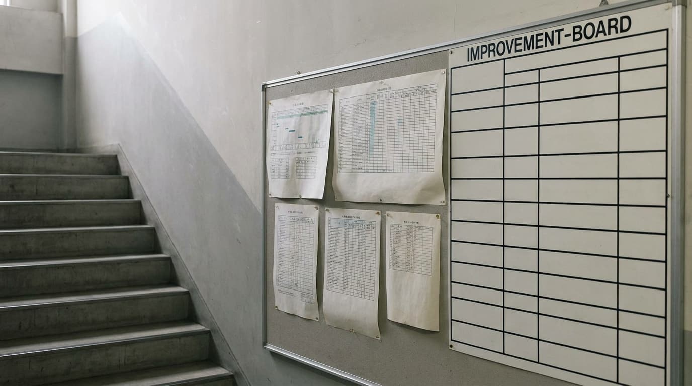
A last observation from watching this done well. The plants that get the most from Pareto analysis don't treat the chart as a monthly report generated in an office. They put it in front of the crew that made the data — on the wall by the line, in the morning meeting — and ask one question: "does this match what you see?"
Sometimes it does, and the chart gains instant credibility. Sometimes an operator says "that's wrong, the wrapper stops way more than the cartoner, we just never log it" — and you've learned something no chart could tell you: where the data itself is bent. Either answer moves you forward.
Twenty problems is a mood. Three problems is a plan. The whole job of the Pareto chart is to make that trade.